Guide to Scientific Writing
Results
Figures
You should present your data in figures (e.g. graphs, pictures) when appropriate. These will demonstrate the results summarized in the text with more detail, and provide the reader the opportunity to interpret the results for themselves. Each figure should be accompanied by a legend that describes the figure precisely. A figure and its legend must be able to stand alone and still be understood by the reader.
Every figure must be referred to in the text, in the order in which it is numbered. Figures are typically numbered using “Arabic” numerals (e.g. 1, 2, 3, etc.) References to figures should be in the following format:
“As light intensity increases, so does seedling growth rate (Fig. 1).”
When are Figures Appropriate?
- As an easy comparison of numbers
- e.g. the number of biology majors in the freshman, sophomore, junior, and senior classes -> In this case, a bar graph would likely be most appropriate
- Showing a relationship between two variables
- e.g. GPA vs. hours spent playing video games -> In this case an x-y scatter plot would be the most appropriate way to present the data.
- Showing trends in data over time
- e.g. population size of rats in an abandoned restaurant dumpster -> In this case, a line graph would be the most appropriate way to present the data.
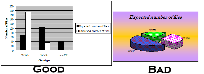
Keep in mind that figures should not be overly complex. There should not be too much data presented in a single figure, and the colors or patterns used should not detract from what the graph is illustrating.